Wednesday, August 16, 2006
About Me

- Name: Bonaia
- Location: Newark, Delaware, United States
All artwork posted is copyrighted to Bonaia Rosado 2006. I grew up in Puerto Rico with seven aunts & uncles, my sister, mom, grandparents, cows, chickens, a goat, some snakes, pigs, a donkey, and a horse. Good times. I now work for Mike Manley as an assistant. In my spare time I paint anything that pops out of my head and I doodle until I feel my hand cramp up.


6 Comments:
I like:
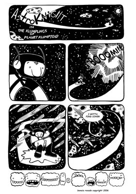
- The rounded-edged panels. NICE
- The character - CUTE!
- The little doods as a footer - CUTER!
I donnalikeasomuch:
- The white-out stars. Try hitting the board with white paint splattered through a thumbed-thru toothbrush. SPRRRRITZ! They look lumpy in some places.
- The little doods as a footer - they're a little too close to the art - bring it down some maybe, or give some variation of their colors - white/black/white/toned/ etc. It's a little too flat and 'white', considering this is a space adventure.
- The font - Don't ever call me again if you keep using COMICSANS. There's people that would throw rocks at your house for that. Do it by hand, since your art is so organic, or try a free spot like Blambot.com. Stay away from comicsans, girl.
LOVE IT! Keep going!
Wait - I think I realized that you did the stars in PSHOP. That's cool - just mess with the pressure and give it some variation.
But what do I know!
That's a great page!! I especially love those funny little characters at the bottom!
Daugh!! There's nothing left for me to say ):o
KEEP UP THE GREAT WORK!!!!!
and buckle up:)
I apologize to all future rock throwers for using such a horrific font. hehehehe... i tried downloading a font and i'm not sure exactly how to install it into my computer.
Nice page! I agree with what Jamar said...and you should hand letter.
Post a Comment
<< Home